components
Tailwind CSS Card
Use FlyonUI's card component to create readable, responsive content displays with Tailwind CSS for your web applications.
A fundamental card includes a title, content, and an additional action content.Cards initially have no predefined width, thus they inherit a 100% width by default unless specified otherwise.
Check out our card component which Utilize card component class.
Welcome to Our Service
Discover the features and benefits that our service offers. Enhance your experience with our user-friendly platform designed to meet all your needs.
<div class="card sm:max-w-sm">
  <div class="card-body">
    <h5 class="card-title mb-2.5">Welcome to Our Service</h5>
    <p class="mb-4">Discover the features and benefits that our service offers. Enhance your experience with our user-friendly platform designed to meet all your needs.</p>
    <div class="card-actions">
      <button class="btn btn-primary">Learn More</button>
    </div>
  </div>
</div>Card sizes with card-{xs|sm|md|lg|xl} utility classes.
Innovative Solutions
Explore our cutting-edge features designed to elevate your experience. Learn how our solutions can help you achieve your goals.
Innovative Solutions
Explore our cutting-edge features designed to elevate your experience. Learn how our solutions can help you achieve your goals.
Innovative Solutions
Explore our cutting-edge features designed to elevate your experience. Learn how our solutions can help you achieve your goals.
Innovative Solutions
Explore our cutting-edge features designed to elevate your experience. Learn how our solutions can help you achieve your goals.
Innovative Solutions
Explore our cutting-edge features designed to elevate your experience. Learn how our solutions can help you achieve your goals.
<!-- Extra small -->
<div class="card card-xs sm:max-w-sm">
  <div class="card-header">
    <h5 class="card-title">Innovative Solutions</h5>
  </div>
  <div class="card-body">
    <p>Explore our cutting-edge features designed to elevate your experience. Learn how our solutions can help you achieve your goals.</p>
  </div>
  <div class="card-footer text-center">
    <p class="text-base-content/50">Learn more about our features.</p>
  </div>
</div>
<!-- Small card -->
<div class="card card-sm sm:max-w-sm">
  <div class="card-header">
    <h5 class="card-title">Innovative Solutions</h5>
  </div>
  <div class="card-body">
    <p>Explore our cutting-edge features designed to elevate your experience. Learn how our solutions can help you achieve your goals.</p>
  </div>
  <div class="card-footer text-center">
    <p class="text-base-content/50">Learn more about our features.</p>
  </div>
</div>

<!-- Medium card -->
<div class="card sm:max-w-sm">
  <div class="card-header">
    <h5 class="card-title">Innovative Solutions</h5>
  </div>
  <div class="card-body">
    <p>Explore our cutting-edge features designed to elevate your experience. Learn how our solutions can help you achieve your goals.</p>
  </div>
  <div class="card-footer text-center">
    <p class="text-base-content/50">Learn more about our features.</p>
  </div>
</div>

<!-- Large card -->
<div class="card card-lg sm:max-w-sm">
  <div class="card-header">
    <h5 class="card-title">Innovative Solutions</h5>
  </div>
  <div class="card-body">
    <p>Explore our cutting-edge features designed to elevate your experience. Learn how our solutions can help you achieve your goals.</p>
  </div>
  <div class="card-footer text-center">
    <p class="text-base-content/50">Learn more about our features.</p>
  </div>
</div>

<!-- Extra large card -->
<div class="card card-xl sm:max-w-sm">
  <div class="card-header">
    <h5 class="card-title">Innovative Solutions</h5>
  </div>
  <div class="card-body">
    <p>Explore our cutting-edge features designed to elevate your experience. Learn how our solutions can help you achieve your goals.</p>
  </div>
  <div class="card-footer text-center">
    <p class="text-base-content/50">Learn more about our features.</p>
  </div>
</div>Simple body example with text.
Welcome to our card Indulge in a delightful journey through our offerings. Jelly lemon drops, tiramisu, chocolate cake, cotton candy, soufflé, and oat cake sweet roll are just a taste of what's in store.
<div class="card sm:max-w-sm">
  <div class="card-body">
    <p>Welcome to our card Indulge in a delightful journey through our offerings. Jelly lemon drops, tiramisu, chocolate cake, cotton candy, soufflé, and oat cake sweet roll are just a taste of what's in store.</p>
  </div>
</div>Example showcasing an image card with content.

Apple Smart Watch
Stay connected, motivated, and healthy with the latest Apple Watch.
<div class="card sm:max-w-sm">
  <figure><img src="https://cdn.flyonui.com/fy-assets/components/card/image-9.png" alt="Watch" /></figure>
  <div class="card-body">
    <h5 class="card-title mb-2.5">Apple Smart Watch</h5>
    <p class="mb-4">Stay connected, motivated, and healthy with the latest Apple Watch.</p>
    <div class="card-actions">
      <button class="btn btn-primary">Buy Now</button>
      <button class="btn btn-secondary btn-soft">Add to cart</button>
    </div>
  </div>
</div>Buttons and links placed within card-actions can be referred to as actions.
Welcome to Our Platform
Explore a range of features and services designed to enhance your experience. Join us and make the most out of what we have to offer.
<div class="card sm:max-w-sm">
  <div class="card-body">
    <h5 class="card-title mb-0">Welcome to Our Platform</h5>
    <div class="text-base-content/50 mb-6">Your journey starts here</div>
    <p class="mb-4">Explore a range of features and services designed to enhance your experience. Join us and make the most out of what we have to offer.</p>
    <div class="card-actions">
      <a href="#" class="link link-primary no-underline">Get Started</a>
      <a href="#" class="link link-primary no-underline">Learn More</a>
    </div>
  </div>
</div>With component class card-header you can specify the styling and content for the header sections of a card element in your web application.
Exclusive Feature Highlight
Discover the unique benefits and features we offer. Dive deeper to learn how our solutions can enhance your experience and meet your needs effectively.
<div class="card sm:max-w-sm">
  <div class="card-header">
    <h5 class="card-title">Exclusive Feature Highlight</h5>
  </div>
  <div class="card-body">
    <p>Discover the unique benefits and features we offer. Dive deeper to learn how our solutions can enhance your experience and meet your needs effectively.</p>
  </div>
</div>With component class card-footer, you can specify the styling and content for the footer sections of a card element in your web application.
Featured Update
Explore the latest enhancements and updates. Stay informed with our new features designed to improve your experience and deliver greater value.
<div class="card sm:max-w-sm">
  <div class="card-body">
    <h5 class="card-title mb-2.5">Featured Update</h5>
    <p>Explore the latest enhancements and updates. Stay informed with our new features designed to improve your experience and deliver greater value.</p>
  </div>
  <div class="card-footer text-base-content/50 text-center">2 days ago</div>
</div>Create a simple list displayed within a card-like interface. Utilize the Divide utility class to add borders between the list items.
- Product Overview
- Key Features
- Customer Reviews
<div class="card">
  <ul class="divide-base-content/20 divide-y">
    <li class="w-72 p-3">Product Overview</li>
    <li class="p-3">Key Features</li>
    <li class="p-3">Customer Reviews</li>
  </ul>
</div>The image’s positioning in the card is determined by the placement of the figure element. When the figure element is the first child, the image will be positioned at the top; conversely, if it is the last child, the image will be positioned at the bottom.
Image at top

Airpods Max
A perfect balance of exhilarating high-fidelity audio and the effortless magic of Airpods.
<div class="card sm:max-w-sm">
  <figure><img src="https://cdn.flyonui.com/fy-assets/components/card/image-7.png" alt="headphone" /></figure>
  <div class="card-body space-y-3">
    <h5 class="card-title">Airpods Max</h5>
    <p>A perfect balance of exhilarating high-fidelity audio and the effortless magic of Airpods.</p>
    <div class="card-actions">
      <button class="btn btn-primary">Buy Now</button>
      <button class="btn btn-secondary btn-soft">Add to cart</button>
    </div>
  </div>
</div>
Or image at bottom
Airpods Max
A perfect balance of exhilarating high-fidelity audio and the effortless magic of Airpods.
<div class="card sm:max-w-sm">
  <div class="card-body">
    <h5 class="card-title mb-2.5">Airpods Max</h5>
    <p>A perfect balance of exhilarating high-fidelity audio and the effortless magic of Airpods.</p>
  </div>
  <figure><img src="https://cdn.flyonui.com/fy-assets/components/card/image-7.png" alt="headphone" /></figure>
</div>By utilizing the image-full modifier class, the image expands to occupy the entire width and is employed as an overlay.

Marketing
Boost your brand's visibility and engagement through targeted marketing strategies.
<div class="card image-full sm:max-w-sm">
  <figure><img src="https://cdn.flyonui.com/fy-assets/components/card/image-5.png" alt="overlay image" /></figure>
  <div class="card-body">
    <h2 class="card-title mb-2.5 text-white">Marketing</h2>
    <p class="text-white">Boost your brand's visibility and engagement through targeted marketing strategies.</p>
  </div>
</div>Apply the glass modifier class to the card component class to impart a glass effect onto the card.
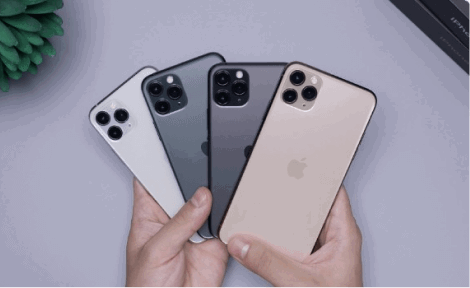
Smartphone
A high-quality smartphone with the latest features for a premium user experience.
<div class="card glass text-white sm:max-w-sm">
  <figure><img src="https://cdn.flyonui.com/fy-assets/components/card/image-1.png" alt="iphones" /></figure>
  <div class="card-body">
    <h2 class="card-title mb-2.5 text-white">Smartphone</h2>
    <p class="mb-4">A high-quality smartphone with the latest features for a premium user experience.</p>
    <div class="card-actions">
      <button class="btn btn-warning">Buy Now</button>
    </div>
  </div>
</div>The card-side class positions images responsively, with options for left or right placement based on breakpoints like sm, md, and lg.
Airpods Max
This is a wider card with supporting text below as a natural lead-in to additional content.
<div class="card sm:card-side max-w-sm sm:max-w-full">
  <figure><img src="https://cdn.flyonui.com/fy-assets/components/card/image-7.png" alt="headphone" /></figure>
  <div class="card-body">
    <h5 class="card-title mb-0.5">Airpods Max</h5>
    <p class="mb-2">This is a wider card with supporting text below as a natural lead-in to additional content.</p>
    <div class="card-actions">
      <button class="btn btn-primary">Buy Now</button>
      <button class="btn btn-secondary btn-soft">Add to cart</button>
    </div>
  </div>
</div>Utilize the card-group class to establish a container for organizing cards into a cohesive group.

Travel to Paris
Discover iconic landmarks, world-class museums, and exquisite cuisine. Explore the Eiffel Tower, Louvre Museum, and charming neighborhoods.

Travel to Rome
Visit ancient ruins, stunning basilicas, and enjoy delicious Italian cuisine. Explore the Colosseum, Vatican City, and more.

Travel to Sydney
Explore the vibrant city of Sydney, where every corner tells a story. Visit iconic landmarks, laze on beautiful beaches, and immerse yourself in a lively arts scene.
<div class="card-group sm:flex *:not-last:border-e *:not-last:border-base-content/25 max-w-sm sm:max-w-full">
  <div class="card">
    <figure><img src="https://cdn.flyonui.com/fy-assets/components/card/image-4.png" alt="paris" /></figure>
    <div class="card-body">
      <h5 class="card-title mb-2.5">Travel to Paris</h5>
      <p>Discover iconic landmarks, world-class museums, and exquisite cuisine. Explore the Eiffel Tower, Louvre Museum, and charming neighborhoods.</p>
    </div>
    <div class="card-footer">
      <p class="text-base-content/50 text-sm">Card text content</p>
    </div>
  </div>
  <div class="card">
    <figure><img src="https://cdn.flyonui.com/fy-assets/components/card/image-3.png" alt="rome" /></figure>
    <div class="card-body">
      <h5 class="card-title mb-2.5">Travel to Rome</h5>
      <p>Visit ancient ruins, stunning basilicas, and enjoy delicious Italian cuisine. Explore the Colosseum, Vatican City, and more.</p>
    </div>
    <div class="card-footer">
      <p class="text-base-content/50 text-sm">Card text content</p>
    </div>
  </div>
  <div class="card">
    <figure><img src="https://cdn.flyonui.com/fy-assets/components/card/image-2.png" alt="sydney" /></figure>
    <div class="card-body">
      <h5 class="card-title mb-2.5">Travel to Sydney</h5>
      <p>Explore the vibrant city of Sydney, where every corner tells a story. Visit iconic landmarks, laze on beautiful beaches, and immerse yourself in a lively arts scene.</p>
    </div>
    <div class="card-footer">
      <p class="text-base-content/50 text-sm">Card text content</p>
    </div>
  </div>
</div>Implement a hover effect on the card image that animates a zoom-out transition.
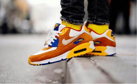
Card title
Nike Air Max is a popular line of athletic shoes that feature Nike's signature Air cushioning technology in the sole.
<div class="card group hover:shadow-sm sm:max-w-sm">
  <figure>
    <img src="https://cdn.flyonui.com/fy-assets/components/card/image-8.png" alt="Shoes" class="transition-transform duration-500 group-hover:scale-110" />
  </figure>
  <div class="card-body">
    <h5 class="card-title mb-2.5">Card title</h5>
    <p class="mb-6">Nike Air Max is a popular line of athletic shoes that feature Nike's signature Air cushioning technology in the sole.</p>
    <div class="card-actions">
      <button class="btn btn-primary">Buy Now</button>
      <button class="btn btn-soft">Add to cart</button>
    </div>
  </div>
</div>Apply a hover animation to the card image that translates it upwards.
Discover a range of delightful treats including lemon drops, tiramisu, chocolate cake, and cotton candy. Our collection offers a variety of flavors to satisfy every craving.
Enjoy a selection of sweet indulgences such as soufflé, oat cake, and sweet rolls. Each item is crafted to bring a touch of sweetness to your day.
<div class="group">
  <div class="card  transition-transform duration-300 group-hover:-translate-y-2 md:max-w-md">
    <div class="card-body">
      <p>Discover a range of delightful treats including lemon drops, tiramisu, chocolate cake, and cotton candy. Our collection offers a variety of flavors to satisfy every craving.</p>
    </div>
  </div>
</div>
<div class="group">
  <div class="card transition-transform duration-300 group-hover:-translate-y-2 md:max-w-md">
    <div class="card-body">
      <p>Enjoy a selection of sweet indulgences such as soufflé, oat cake, and sweet rolls. Each item is crafted to bring a touch of sweetness to your day.</p>
    </div>
  </div>
</div>Basic tabs in card example.
Welcome to the Home tab! Here, you can explore the latest updates, news, and highlights. Stay informed about what's happening and never miss out on important announcements.
This is your Profile tab. Manage your personal information, update your account details, and customize your settings to make your experience unique.
Messages: Check your recent messages, start new conversations, and stay connected with your friends and contacts. Manage your chat history and keep the communication flowing.
<div class="card md:max-w-md">
  <nav class="tabs tabs-bordered card-header" aria-label="Tabs" role="tablist">
    <button type="button" class="tab active-tab:tab-active active w-full" id="tabs-card-item-1" data-tab="#tabs-card-1" aria-controls="tabs-card-1" role="tab" aria-selected="true">
      Home
    </button>
    <button type="button" class="tab active-tab:tab-active w-full" id="tabs-card-item-2" data-tab="#tabs-card-2" aria-controls="tabs-card-2" role="tab" aria-selected="false">
      Profile
    </button>
    <button type="button" class="tab active-tab:tab-active w-full" id="tabs-card-item-3" data-tab="#tabs-card-3" aria-controls="tabs-card-3" role="tab" aria-selected="false">
      Messages
    </button>
  </nav>

  <div class="card-body">
    <div id="tabs-card-1" role="tabpanel" aria-labelledby="tabs-card-item-1">
      <p class="text-base-content/80">
        Welcome to the
        <span class="text-base-content font-semibold">Home tab!</span>
        Here, you can explore the latest updates, news, and highlights. Stay informed about what's happening and never miss out on important announcements.
     </p>
    </div>
    <div id="tabs-card-2" class="hidden" role="tabpanel" aria-labelledby="tabs-card-item-2">
      <p class="text-base-content/80">
        This is your
        <span class="text-base-content font-semibold">Profile</span>
        tab. Manage your personal information, update your account details, and customize your settings to make your experience unique.
     </p>
    </div>
    <div id="tabs-card-3" class="hidden" role="tabpanel" aria-labelledby="tabs-card-item-3">
      <p class="text-base-content/80">
        <span class="text-base-content font-semibold">Messages:</span>
        Check your recent messages, start new conversations, and stay connected with your friends and contacts. Manage your chat history and keep the communication flowing.
     </p>
    </div>
  </div>
</div>Feel free to apply this variation to all our semantic color utility classes or Tailwind colors.
Customer Support
Enhance customer satisfaction by providing timely and effective support solutions.
Customer Support
Enhance customer satisfaction by providing timely and effective support solutions.
Customer Support
Enhance customer satisfaction by providing timely and effective support solutions.
<div class="card bg-primary text-primary-content">
  <div class="card-body">
    <h5 class="card-title text-primary-content mb-2.5">Customer Support</h5>
    <p>Enhance customer satisfaction by providing timely and effective support solutions.</p>
  </div>
</div>
<div class="card bg-primary/20 border-primary text-primary border shadow-none">
  <div class="card-body">
    <h5 class="card-title text-primary mb-2.5">Customer Support</h5>
    <p>Enhance customer satisfaction by providing timely and effective support solutions.</p>
  </div>
</div>
<div class="card border-primary text-primary border bg-transparent shadow-none">
  <div class="card-body">
    <h5 class="card-title text-primary mb-2.5">Customer Support</h5>
    <p>Enhance customer satisfaction by providing timely and effective support solutions.</p>
  </div>
</div>By default, text is aligned left. You can modify the alignment using utility classes such as text-center or text-right.
Customer Support
Enhance customer satisfaction by providing timely and effective support solutions.
Customer Support
Enhance customer satisfaction by providing timely and effective support solutions.
Customer Support
Enhance customer satisfaction by providing timely and effective support solutions.
<div class="card">
  <div class="card-body">
    <h5 class="card-title mb-2.5">Customer Support</h5>
    <p>Enhance customer satisfaction by providing timely and effective support solutions.</p>
  </div>
</div>

<div class="card text-center">
  <div class="card-body">
    <h5 class="card-title mb-2.5">Customer Support</h5>
    <p>Enhance customer satisfaction by providing timely and effective support solutions.</p>
  </div>
</div>

<div class="card text-right">
  <div class="card-body">
    <h5 class="card-title mb-2.5">Customer Support</h5>
    <p>Enhance customer satisfaction by providing timely and effective support solutions.</p>
  </div>
</div>You can use card-border for bordered card.
Welcome to Our Service
Discover the features and benefits that our service offers. Enhance your experience with our user-friendly platform designed to meet all your needs.
<div class="card card-border shadow-none sm:max-w-sm">
  <div class="card-body">
    <h5 class="card-title mb-2.5">Welcome to Our Service</h5>
    <p class="mb-4">Discover the features and benefits that our service offers. Enhance your experience with our user-friendly platform designed to meet all your needs.</p>
    <div class="card-actions">
      <button class="btn btn-primary">Learn More</button>
    </div>
  </div>
</div>You can use the card-alert class to style alert messages inside a card.
Security Alert
We have detected a potential security vulnerability. Please update your settings to ensure your data remains safe. Click the link below for detailed instructions.
Update Now<div class="card md:max-w-md">
<div class="card-alert alert alert-error alert-soft" role="alert">
<span class="font-bold">Attention:</span>
Important security update required.
</div>
<div class="card-body">
<h5 class="card-title mb-2.5">Security Alert</h5>
<p class="mb-4">We have detected a potential security vulnerability. Please update your settings to ensure your data remains safe. Click the link below for detailed instructions.</p>
<a href="#" class="text-blue-500 hover:underline">Update Now</a>
</div>
</div>Show an empty state placeholder when no data is available, providing friendly tips for users.
<div class="card min-h-60 w-full">
  <div class="card-body items-center justify-center">
    <span class="icon-[tabler--brand-google-drive] mb-2 size-8"></span>
    <span>No data to show.</span>
  </div>
</div>Utilize the data-remove-element attribute to specify the connected ID for card removal. Customize the removal animation by incorporating the removing: modifier, as illustrated below.
Important Update
Stay informed with the latest updates and features that enhance your experience. Click on the icons above to refresh, maximize, or close this card.
Learn more<div class="card removing:translate-x-5 removing:opacity-0 w-full transition duration-300 ease-in-out" id="card-dismiss" >
<div class="card-header flex justify-between items-center">
<span class="card-title">Card Actions</span>
<div class="card-actions flex gap-0.5 sm:gap-3 flex-nowrap">
<div class="tooltip">
<button class="tooltip-toggle btn btn-text btn-sm btn-circle" aria-label="Refresh Button">
<span class="icon-[tabler--refresh] size-5"></span>
</button>
<span class="tooltip-content tooltip-shown:opacity-100 tooltip-shown:visible" role="tooltip">
<span class="tooltip-body">Refresh</span>
</span>
</div>
<div class="tooltip">
<button class="tooltip-toggle btn btn-text btn-sm btn-circle" aria-label="Maximize Button">
<span class="icon-[tabler--arrows-maximize] size-5"></span>
</button>
<span class="tooltip-content tooltip-shown:opacity-100 tooltip-shown:visible" role="tooltip">
<span class="tooltip-body">Maximize</span>
</span>
</div>
<div class="tooltip">
<button class="tooltip-toggle btn btn-text btn-sm btn-circle" aria-label="Close Button" data-remove-element="#card-dismiss">
<span class="icon-[tabler--x] size-5"></span>
</button>
<span class="tooltip-content tooltip-shown:opacity-100 tooltip-shown:visible" role="tooltip">
<span class="tooltip-body">Close</span>
</span>
</div>
</div>
</div>
<div class="card-body">
<h5 class="card-title mb-2.5">Important Update</h5>
<p class="mb-4">Stay informed with the latest updates and features that enhance your experience. Click on the icons above to refresh, maximize, or close this card.</p>
<a href="#" class="text-blue-500 hover:underline">Learn more</a>
</div>
</div>