overlays
Tailwind CSS Tooltip
A tooltip is a small, informative message that appears when a user hovers over or focuses on an element for additional context.
We harnessed FloatingUI to supercharge our tooltip experience.
Utilize the class tooltip as the target for JavaScript to address the tooltip component, and use the component class tooltip-content for the tooltip container. Apply the Tailwind CSS display utility classes opacity-100 and visible to the tooltip-shown: modifier to toggle the visibility of the tooltip and make it visible.
Apply the component class tooltip-toggle to a button or any other element to trigger the appearance of the tooltip upon hovering.
Include any text or markup within the component class tooltip-body that you wish to display in the tooltip.
Use below given example for default tooltip on hover.
<div class="tooltip">
  <button type="button" class="tooltip-toggle btn btn-square" aria-label="Tooltip">
    <span class="icon-[tabler--chevron-up]"></span>
  </button>
  <span class="tooltip-content tooltip-shown:opacity-100 tooltip-shown:visible" role="tooltip">
    <span class="tooltip-body">Tooltip on top</span>
  </span>
</div>Use modifier class tooltip-{semantic-color} with component class tooltip-body for colored tooltip.
<!-- Primary tooltip -->
<div class="tooltip">
  <button type="button" class="tooltip-toggle btn btn-square btn-primary" aria-label="Primary Tooltip">
    <span class="icon-[tabler--chevron-up]"></span>
  </button>
  <span class="tooltip-content tooltip-shown:opacity-100 tooltip-shown:visible" role="tooltip">
    <span class="tooltip-body tooltip-primary">Primary tooltip</span>
  </span>
</div>
<!-- Secondary tooltip -->
<div class="tooltip">
  <button type="button" class="tooltip-toggle btn btn-square btn-secondary" aria-label="Secondary Tooltip">
    <span class="icon-[tabler--chevron-up]"></span>
  </button>
  <span class="tooltip-content tooltip-shown:opacity-100 tooltip-shown:visible" role="tooltip">
    <span class="tooltip-body tooltip-secondary">Secondary tooltip</span>
  </span>
</div>
<!-- Accent tooltip -->
<div class="tooltip">
  <button type="button" class="tooltip-toggle btn btn-square btn-accent" aria-label="Accent Tooltip">
    <span class="icon-[tabler--chevron-up]"></span>
  </button>
  <span class="tooltip-content tooltip-shown:opacity-100 tooltip-shown:visible" role="tooltip">
    <span class="tooltip-body tooltip-accent">Accent tooltip</span>
  </span>
</div>
<!-- Info tooltip -->
<div class="tooltip">
  <button type="button" class="tooltip-toggle btn btn-square btn-info" aria-label="Info Tooltip">
    <span class="icon-[tabler--chevron-up]"></span>
  </button>
  <span class="tooltip-content tooltip-shown:opacity-100 tooltip-shown:visible" role="tooltip">
    <span class="tooltip-body tooltip-info">Info tooltip</span>
  </span>
</div>
<!-- Success tooltip -->
<div class="tooltip">
  <button type="button" class="tooltip-toggle btn btn-square btn-success" aria-label="Success Tooltip">
    <span class="icon-[tabler--chevron-up]"></span>
  </button>
  <span class="tooltip-content tooltip-shown:opacity-100 tooltip-shown:visible" role="tooltip">
    <span class="tooltip-body tooltip-success">Success tooltip</span>
  </span>
</div>
<!-- Warning tooltip -->
<div class="tooltip">
  <button type="button" class="tooltip-toggle btn btn-square btn-warning" aria-label="Warning Tooltip">
    <span class="icon-[tabler--chevron-up]"></span>
  </button>
  <span class="tooltip-content tooltip-shown:opacity-100 tooltip-shown:visible" role="tooltip">
    <span class="tooltip-body tooltip-warning">Warning tooltip</span>
  </span>
</div>
<!-- Error tooltip -->
<div class="tooltip">
  <button type="button" class="tooltip-toggle btn btn-square btn-error" aria-label="Error Tooltip">
    <span class="icon-[tabler--chevron-up]"></span>
  </button>
  <span class="tooltip-content tooltip-shown:opacity-100 tooltip-shown:visible" role="tooltip">
    <span class="tooltip-body tooltip-error">Error tooltip</span>
  </span>
</div>Utilize the JavaScript option class [--placement:{direction}] to specify the tooltip placement in various directions. Here, direction can be top, bottom, left, or right. By default, the tooltip is positioned at the top. Tooltip component supports the same placement options as the
Dropdown
component. However, as Tooltips are most commonly used with these four placements, we have provided examples for these specific options.
<!-- Left tooltip -->
<div class="tooltip [--placement:left]">
  <button type="button" class="tooltip-toggle btn btn-square" aria-label="Tooltip">
    <span class="icon-[tabler--chevron-left]"></span>
  </button>
  <span class="tooltip-content tooltip-shown:opacity-100 tooltip-shown:visible" role="tooltip">
    <span class="tooltip-body">Tooltip on left</span>
  </span>
</div>
<!-- Top tooltip (default) -->
<div class="tooltip">
  <button type="button" class="tooltip-toggle btn btn-square" aria-label="Tooltip">
    <span class="icon-[tabler--chevron-up]"></span>
  </button>
  <span class="tooltip-content tooltip-shown:opacity-100 tooltip-shown:visible" role="tooltip">
    <span class="tooltip-body">Tooltip on top</span>
  </span>
</div>
<!-- Bottom tooltip -->
<div class="tooltip [--placement:bottom]">
  <button type="button" class="tooltip-toggle btn btn-square" aria-label="Tooltip">
    <span class="icon-[tabler--chevron-down]"></span>
  </button>
  <span class="tooltip-content tooltip-shown:opacity-100 tooltip-shown:visible" role="tooltip">
    <span class="tooltip-body">Tooltip on bottom</span>
  </span>
</div>
<!-- Right tooltip -->
<div class="tooltip [--placement:right]">
  <button type="button" class="tooltip-toggle btn btn-square" aria-label="Tooltip">
    <span class="icon-[tabler--chevron-right]"></span>
  </button>
  <span class="tooltip-content tooltip-shown:opacity-100 tooltip-shown:visible" role="tooltip">
    <span class="tooltip-body">Tooltip on right</span>
  </span>
</div>Please utilize the provided example for creating an image tooltip.
The
Himalayas
About Himalayas
The Great Himalayan mountain ranges in the Indian sub-continent region.
Read more
 , Asia's towering mountain range, separates the Indian subcontinent from the Tibetan Plateau. Mount Everest, Earth's
highest peak, and over 100 others surpass 7,200 m. Spanning Nepal, China, Pakistan, Bhutan, and India, they birth
major rivers like the Indus and the Ganges. Home to 600 million people, they shape South Asian and Tibetan cultures.
, Asia's towering mountain range, separates the Indian subcontinent from the Tibetan Plateau. Mount Everest, Earth's
highest peak, and over 100 others surpass 7,200 m. Spanning Nepal, China, Pakistan, Bhutan, and India, they birth
major rivers like the Indus and the Ganges. Home to 600 million people, they shape South Asian and Tibetan cultures.
<p>
  The
  <span class="tooltip">
    <span class="tooltip-toggle">
      <a href="https://en.wikipedia.org/wiki/Himalayas" class="link link-primary link-hover">Himalayas</a>
      <span class="tooltip-content tooltip-shown:opacity-100 tooltip-shown:visible p-4" role="popover">
        <span class="tooltip-body bg-base-100 flex max-w-64 sm:max-w-xs rounded-lg p-0 text-start">
          <span class="text-base-content/80 flex w-1/2 flex-col justify-between p-2 sm:p-4 text-xs">
            <span class="text-base-content text-base font-medium">About Himalayas</span>
            The Great Himalayan mountain ranges in the Indian sub-continent region.
            <a href="https://en.wikipedia.org/wiki/Himalayas" target="blank" class="link link-primary link-hover flex items-center" >
              Read more
              <span class="icon-[tabler--chevron-right] rtl:rotate-180 mt-0.5"></span>
            </a>
          </span>
          <img src="https://lp-cms-production.imgix.net/2021-01/GettyRF_450207051.jpg?width=232" alt="the himalayas" class="h-40 w-1/2 rounded-e-lg object-cover" />
        </span>
      </span>
    </span>
  </span>
  , Asia's towering mountain range, separates the Indian subcontinent from the Tibetan Plateau. Mount Everest, Earth's
  highest peak, and over 100 others surpass 7,200 m. Spanning Nepal, China, Pakistan, Bhutan, and India, they birth
  major rivers like the Indus and the Ganges. Home to 600 million people, they shape South Asian and Tibetan cultures.
</p>Below given example shows user details tooltip upon hover.
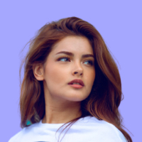
Lead Software Architect.
ABC Technologies
<div class="tooltip [--placement:bottom-start] sm:[--placement:right]">
  <div class="tooltip-toggle">
    <div class="bg-base-100 shadow-base-300/20 flex items-center gap-3 rounded-lg p-2 shadow-sm hover:cursor-pointer" >
      <img src="https://cdn.flyonui.com/fy-assets/avatar/avatar-10.png" alt="Sophia" class="size-8 rounded-full object-cover" />
      <div class="flex flex-col items-start pe-4">
        <span class="text-base-content font-medium">Sophia Aldrin</span>
        <span class="text-base-content/80 -mt-1 text-xs">@sophia23</span>
      </div>
    </div>
    <div class="tooltip-content tooltip-shown:opacity-100 tooltip-shown:visible" role="popover">
      <div class="tooltip-body bg-base-100 text-base-content/80 w-80 rounded-lg p-4 text-start">
        <div class="mb-4 flex items-start justify-between">
          <img src="https://cdn.flyonui.com/fy-assets/avatar/avatar-10.png" alt="Sophia" class="size-12 rounded-full object-cover" />
          <button class="btn btn-primary btn-sm">Follow</button>
        </div>
        <div class="flex flex-col">
          <div class="text-base-content text-lg font-medium">Sophia Aldrin</div>
          <div class="-mt-1 text-xs">@sophia23</div>
          <p class="mt-4">
            Lead Software Architect.
            <br/>
            <a href="#" class="link link-primary link-animated text-sm">ABC Technologies</a>
          </p>
          <div class="mt-4 space-y-2">
            <div class="flex items-center gap-1.5">
              <span class="icon-[tabler--mail] size-4"></span>
              sophia23@gmail.com
            </div>
            <div class="flex items-center gap-1.5">
              <span class="icon-[tabler--phone] size-4"></span>+(101) 123-456-7891
            </div>
            <div class="flex items-center gap-1.5">
              <span class="icon-[tabler--map-pin] size-4"></span>
              Ontario, Canada
            </div>
          </div>
          <div class="divider my-4"></div>
          <div class="text-sm flex items-center gap-3">
            <div>
              <span class="text-base-content me-1 font-medium">478</span>
              Following
            </div>
            <div>
              <span class="text-base-content me-1 font-medium">1,984</span>
              Followers
            </div>
          </div>
        </div>
      </div>
    </div>
  </div>
</div>Below given example shows descriptive tooltip upon hover.
- Welcome to FlyonUI. If you continue to browse and use this TailwindCSS component library, you are agreeing to comply with and be bound by the following terms and conditions of its use.
- The content of the pages of this website is for your general information and use only. It is subject to change without notice.
- This website uses cookies to monitor browsing preferences. If you do allow cookies to be used, the following personal information may be stored by us for use by third parties.
- Neither we nor any third parties provide any warranty or guarantee as to the accuracy, timeliness, performance, completeness, or suitability of the information and materials found or offered on this website for any particular purpose.
- Your use of any information or materials on this website is entirely at your own risk, for which we shall not be liable. It shall be your own responsibility to ensure that any products, services, or information available through this website meet your specific requirements.
<div class="flex items-center gap-1">
  <span>Terms & Conditions</span>
  <div class="tooltip [--placement:bottom]">
    <div class="tooltip-toggle">
      <span class="icon-[tabler--help] hover:text-primary mt-1.5 size-4"></span>
      <div class="tooltip-content tooltip-shown:opacity-100 tooltip-shown:visible" role="popover">
        <div class="tooltip-body bg-base-100 text-base-content/80 max-w-xs rounded-lg p-4 text-start">
          <span class="text-lg text-base-content">Terms and Conditions</span>
          <ul class="mt-4 space-y-1.5 text-xs">
            <li>
              Welcome to FlyonUI. If you continue to browse and use this TailwindCSS component library, you are agreeing to comply with
              and be bound by the following terms and conditions of its use.
            </li>
            <li>
              The content of the pages of this website is for your general information and use only. It is subject to
              change without notice.
            </li>
            <li>
              This website uses cookies to monitor browsing preferences. If you do allow cookies to be used, the
              following personal information may be stored by us for use by third parties.
            </li>
            <li>
              Neither we nor any third parties provide any warranty or guarantee as to the accuracy, timeliness,
              performance, completeness, or suitability of the information and materials found or offered on this
              website for any particular purpose.
            </li>
            <li>
              Your use of any information or materials on this website is entirely at your own risk, for which we shall
              not be liable. It shall be your own responsibility to ensure that any products, services, or information
              available through this website meet your specific requirements.
            </li>
          </ul>
        </div>
      </div>
    </div>
  </div>
</div>The destroy method is provided to facilitate the destruction of a tooltip element.
<div id="tooltip-to-destroy">
  <div class="tooltip">
    <button type="button" class="tooltip-toggle btn btn-square" aria-label="Tooltip">
      <span class="icon-[tabler--chevron-up]"></span>
    </button>
    <span class="tooltip-content tooltip-shown:opacity-100 tooltip-shown:visible" role="tooltip">
      <span class="tooltip-body">Tooltip</span>
    </span>
  </div>
</div>

<div class="mt-4 flex gap-3">
  <button class="btn btn-primary" id="destroy-btn">Destroy</button>
  <button class="btn btn-primary" id="reinit-btn" disabled>Reinitialize</button>
</div><script>
window.addEventListener('load', () => {
;(function () {
const tooltips = document.querySelector('#tooltip-to-destroy .tooltip')
const destroy = document.querySelector('#destroy-btn')
const reinit = document.querySelector('#reinit-btn')
destroy.addEventListener('click', () => {
const { element } = HSTooltip.getInstance(tooltips, true)
element.destroy()
destroy.setAttribute('disabled', 'disabled')
reinit.removeAttribute('disabled')
})
reinit.addEventListener('click', () => {
HSTooltip.autoInit()
reinit.setAttribute('disabled', 'disabled')
destroy.removeAttribute('disabled')
})
})()
});
</script>PARAMETERS | DESCRIPTION | OPTIONS | DEFAULT VALUE |
|---|---|---|---|
[--trigger:*] | Event to trigger a tooltip. | hover, click | hover |
[--placement:*] | Tooltip placement. | top, top-start, top-end, bottom, bottom-start, bottom-end, right, right-start, right-end, left, left-start, left-end | top |
[--strategy:*] | Sets the position to absolute instead of fixed, and removes the transform styles to position the menu relative to the relative parent block. | fixed, absolute | fixed |
[--interaction:*] | Adjusts interactivity within the tooltip/popover content. | boolean | false |
[-—prevent-popper:*] | Prevents popper positioning calculation issue. | boolean | false |
The HSTooltip object is contained within the global window object.
METHOD | DESCRIPTION |
|---|---|
| PUBLIC METHODS | |
show() | Force show tooltip. |
hide() | Force hide tooltip. |
destroy() | Destroys the instance, removes generated markup (if any), removes added classes and attributes. |
| STATIC METHODS | |
HSTooltip.getInstance(target, isInstance) | Returns the element associated to the target.
|
HSTooltip.show(target) | Shows the element associated to the target.
|
HSTooltip.hide(target) | Shows the element associated to the target.
|
Below is a demonstration of how to use the public methods. Apply the ID to the tooltip component class and target it using the methods. We’ve included JavaScript for a public method, enabling it to function when the method button is clicked. To test other methods, copy and paste the following code into your console, then click the button.
<div class="tooltip" id="tooltip-target">
  <div class="tooltip-toggle">
    <button class="btn btn-square" aria-label="Tooltip"><span class="icon-[tabler--chevron-up]"></span></button>
    <div class="tooltip-content tooltip-shown:opacity-100 tooltip-shown:visible" role="tooltip">
      <span class="tooltip-body">Tooltip</span>
    </div>
  </div>
</div>

<button class="btn btn-primary" id="show-btn">Method</button><script>
window.addEventListener('load', function () {
const tooltip = new HSTooltip(document.querySelector('#tooltip-target'))
const showBtn = document.querySelector('#show-btn')
showBtn.addEventListener('click', () => {
tooltip.show()
document.addEventListener('click', () => {
tooltip.hide()
})
})
})
</script>Force show tooltip (public method).
// This method is used in above example.
const tooltip = new HSTooltip(document.querySelector('#tooltip-target'));
const showBtn = document.querySelector('#show-btn');

showBtn.addEventListener('click', () => {
  tooltip.show();
});
Force show tooltip (static method).
const showBtn = document.querySelector('#show-btn');

showBtn.addEventListener('click', () => {
  HSTooltip.show('#tooltip-target');
});
Open item (mixed).
const { element } = HSTooltip.getInstance('#tooltip-target', true);
const showBtn = document.querySelector('#show-btn');

showBtn.addEventListener('click', () => {
  element.show();
});
Destroy instance (public).
const tooltip = document.querySelector('.tooltip')
const { element } = HSTooltip.getInstance(tooltip, true)

destroy.addEventListener('click', () => {
  element.destroy()
})METHOD | DESCRIPTION |
|---|---|
on:show | Triggered whenever a tooltip is showed. |
on:hide | Triggered whenever a tooltip is hidden. |
Below is a demonstration of how to use the event. We’ve included JavaScript to handle the events, allowing it to execute when the corresponding event is fired. To test these events, monitor your console.
<div class="tooltip [--trigger:hover]" id="tooltip-target-2">
  <div class="tooltip-toggle">
    <button class="btn btn-square" aria-label="Tooltip"><span class="icon-[tabler--chevron-up]"></span></button>
    <div class="tooltip-content tooltip-shown:opacity-100 tooltip-shown:visible" role="tooltip">
      <span class="tooltip-body">Tooltip</span>
    </div>
  </div>
</div><script>
window.addEventListener('load', function () {
const { element } = HSTooltip.getInstance('#tooltip-target-2', true)
element.on('show', instance => console.log('show'))
element.on('hide', instance => console.log('hide'))
})
</script>An example where a function is run every time a tooltip shows.
const { element } = HSTooltip.getInstance('#tooltip-target-2', true)

element.on('show', (instance) => console.log("show"));
element.on('hide', (instance) => console.log("hide"));