Blocks
Build responsive layouts with FlyonUI Pro Blocks and Tailwind CSS for rapid, professional web development.
A Block refers to a segment of pre-designed code, crafted by professional designers and developers to provide reusable components or structures within a project. This modular approach helps streamline the development process, ensuring consistency and efficiency.
For the full blog, check out our post on dev.to.
Before getting started, make sure your project is properly set up with FlyonUI. Refer to the official Getting Started / Installation docs for setup instructions.
Once your project is ready, you can begin integrating blocks seamlessly.
Access Pro Blocks:
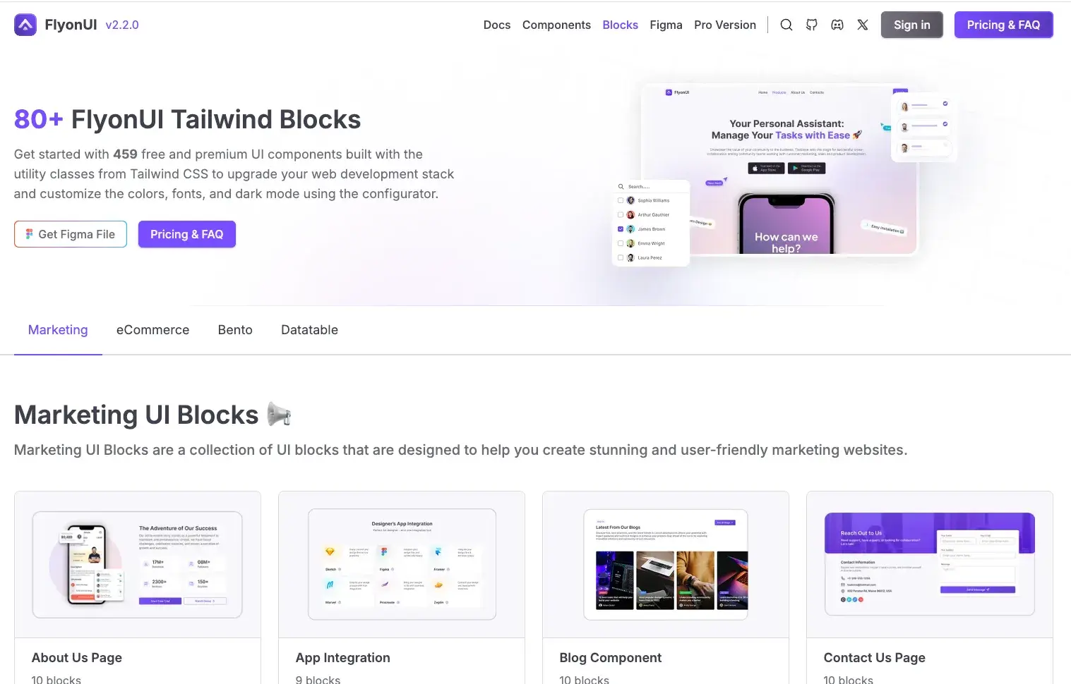
FlyonUI offers over 500+ premium blocks and sections, which you can easily copy and use in your project. Here’s how to access them:
Step 1: Log In to Your Account
- Go to flyonui.com and log in using your credentials.
Step 2: Navigate to the Blocks Page
- Visit the Blocks page to explore categories like Marketing, eCommerce, Bento, Datatable, and more.
Step 3: Select and Copy the Code
Choose your desired block (e.g., Hero Section).
Click the Code tab to view the HTML, CSS, and JavaScript.
If the block contains a Third-Party badge, setup the mentioned Third-Party package for the code to function properly.
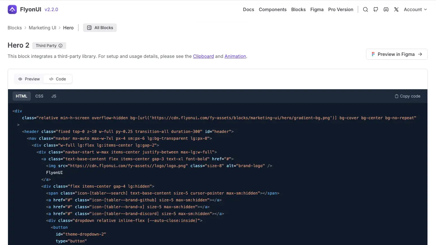
Copy the code and paste it into your project where needed.
Customizing blocks is easy with TailwindCSS and FlyonUI semantic classes. Here’s how you can do it:
Using TailwindCSS:
TailwindCSS provides utility classes to easily adjust the spacing, padding, margins, and other layout properties.
For example:
Padding: You can adjust padding using classes like
p-2,p-4(increasing the padding).<div class="p-4"> <!-- Your content goes here --> </div>Margins: Similarly, you can adjust margins using classes like
m-2orm-4.<div class="m-4"> <!-- Your content goes here --> </div>Gap: You can also use the
gapclass to adjust the space between elements within a flex or grid layout.
Using FlyonUI Semantic Classes:
FlyonUI offers predefined classes for common UI elements like buttons and backgrounds.
For example:
Change Button Style: You can change button styles using classes like
btn-primarytobtn-successto switch from a default button to a success button.<button class="btn btn-primary">Primary Button</button> To <button class="btn btn-success">Success Button</button>
Update Icons
- Blocks use Tabler icons from Iconify/tabler, but you can also use any other font library of your choice. For more information, refer to the icon documentation .
With these simple tools, you can quickly adjust and style your blocks using both TailwindCSS and FlyonUI classes without needing to write extra CSS.
The Copy Prompt feature in FlyonUI allows you to quickly generate AI-optimized prompts for effortless integration of components/blocks into your project. Click the Copy Prompt button on any component/blocks section. Paste the copied prompt into your preferred IDE like VS Code, Cursor, or Windsurf and append custom instructions such as desired layout, placement context, or target framework conversions. Let the AI editor do the rest. It will automatically convert the copied code into a framework-specific format, making it easy to use in your project./rui command. This command allows you to interact with the MCP Server and make changes to the blocks/components as per your requirements.Example: /rui Update the layout of hero section from vertical to Horizontal.
Set up FlyonUI in your chosen framework. For detailed instructions, refer to the framework integration documentation.
Then, simply use the copy prompt functionality to copy the entire code and, with the help of the AI editor, convert it into a framework-specific format.
<!-- Block Prompt -->
 ....
<!-- /Block Prompt -->

Convert the above code into a React/Vue/Astro component with the correct structure.
FlyonUI offers a variety of pre-designed themes that allow you to effortlessly transform the appearance of your website. This time-saving feature removes the hassle of selecting color schemes, so you can focus on refining your site’s structure and content while FlyonUI takes care of the design.
For more details, check out the Theme docs .
