Creating a color system in Figma that’s optimized for Tailwind CSS ensures consistency across your design and development workflow. Tailwind uses a semantic, scale-based approach to colors (e.g., bg-primary-500 for a primary brand color at mid-intensity), with scales typically ranging from 50 (lightest tint) to 950 (darkest shade). This process is essential for developing a Tailwind Ready Color System in Figma.
Table of Contents
What is a Design System and Why Does it Matter?

A well-structured Tailwind Ready Color System in Figma allows designers to iterate quickly while maintaining clarity in color definitions.
A Tailwind Ready Color System in Figma helps set a strong foundation for your design projects.
A design system is a collection of reusable components, styles, and guidelines that help teams create consistent and efficient designs. It’s important because:
A well-structured Tailwind Ready Color System in Figma can significantly reduce the time spent on design iterations. With clear color definitions, developers can easily understand and implement the designs without confusion.
Establishing a Tailwind Ready Color System in Figma will set a strong foundation for your design projects, allowing for seamless integration with Tailwind CSS.
- It keeps products visually cohesive
- Speeds up design and development
- Makes collaboration between designers and developers much smoother
It’s the backbone that helps teams build better products faster.
What is Tailwind and Why Use It?
Tailwind is a utility-first CSS framework that lets you build custom, consistent designs quickly by using small, reusable classes. It’s powerful because:
- Speeds up development
- Keeps designs consistent
- Makes collaboration between designers and developers smoother
This is the default color palette in Tailwind CSS version 4.1. Tailwind is a CSS framework that developers enjoy using because it makes styling super fast. All these colors are already available in code, so developers don’t have to worry about picking the right shades, tints, or scales for a product it’s ready to use.
However, most designers prefer tweaking this palette or bringing in their own brand colors to keep the product unique and on-brand.
Utilizing a Tailwind ready color system in Figma facilitates better communication, ensuring a shared understanding of color usage across teams. Hre, using a ready to use Tailwind Figma UI kit can enhance this by offering semantic color schemes and themes (e.g., Light, Dark, Corporate) that integrate seamlessly with Tailwind v4.0, allowing for Dark Mode support without extra classes.
Guide for Building Tailwind Ready Color System In Figma:
Creating a Tailwind Ready Color System in Figma is essential for designers looking to enhance their workflow and ensure consistency in their projects.
By implementing a Tailwind Ready Color System in Figma, you can achieve visual harmony and readiness for development.
Implementing a Tailwind Ready Color System in Figma not only promotes visual harmony but also ensures that your designs are ready for development. This approach allows designers to create intricate designs while maintaining the flexibility that the Tailwind framework provides.
This guide walks you through building a scalable, reusable color palette in Figma, complete with styles, documentation, and export tips for Tailwind integration.
By the end, you’ll have a Figma file with color swatches, variables, and styles that map directly to Tailwind’s configuration (e.g., tailwind.config.js).
Prerequisites:
- Figma Account: Free or paid (paid unlocks team libraries for sharing styles).
- Basic Figma Knowledge: Familiarity with frames, rectangles, and text tools.
- Tailwind Basics: Understand Tailwind’s color utilities (e.g.,
text-slate-900). - Optional Tools: Figma’s “Variables” feature (beta as of 2023; enable in Labs if needed) for dynamic scales, or plugins like “Color Style Guide” or “Tailwind CSS” for export.
Start with a new Figma file: Go to figma.com > New File.
1. Choose Your Color Palette
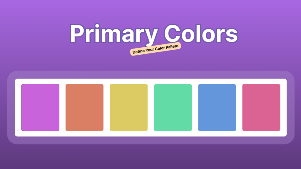
Choosing the right color palette is the first and most crucial step in setting up a Tailwind ready color system. This is where you’ll decide on the primary, secondary, and accent colors that will form the foundation of your design. To make the process easier, you’ll break it down into bullet points:
- Add Primary Colors Start by defining your primary colors, which serve as the base hues for your entire design system. These are the core colors that represent your brand and will be used throughout the product, such as primary buttons, headings, links, etc.
- Create a Frame for Your Color Palette Next, you’ll want to create a frame or container for your color palette in Figma. This helps you visualize the whole spectrum of colors, from primary to accent shades, and ensures that all your colors are neatly organized and easy to access.
- Select a Rectangle and Adjust Color Settings Once your frame is set, create a rectangle shape and choose your brand color to start with. Change the color mode from RGB to HSLA (Hue, Saturation, Lightness, Alpha) for better control over the color adjustments. This allows for precise fine-tuning of each color to get the exact tone and hue that you want.
- Duplicate and Adjust for Different Shades To build a complete palette, duplicate the initial rectangle and then modify the color slider to generate the necessary color variations. By adjusting the sliders, you can create primary, secondary, and accent colors. This way, you’ll have a comprehensive set of colors that are harmonious and ready for use.
2. How to Generate Tints and Shades for Your Color Palette
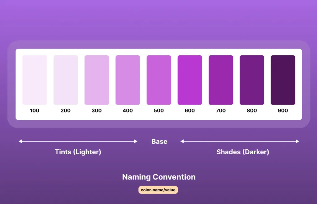
Generating tints and shades is a key step in creating a comprehensive color palette for your design system. Before diving into the process, it’s essential to understand how the color scale is structured.
Each primary color in your palette follows an 11 stack of colors, with the base color placed at 500, acting as the standard or neutral tone. The shades, which are the darker variations of the base color, are positioned to the right of 500 (ranging from 600 to 950), while the tints, or lighter variations, are placed to the left of 500 (ranging from 50 to 400).
This structure ensures a balanced and cohesive range of color tones that can be used throughout your design system. This approach ensures that your color palette remains balanced and offers a wide range of shades and tints for different use cases.
To manually generate tints and shades, follow these steps:
- Set Your Brand Color as the Base Start by selecting your primary brand color and setting it as the 500 value the middle ground of your palette.
- Creating Shades To generate darker shades, duplicate the base color, decrease the lightness, and nudge the value by -10 for each step. Repeat this process for each increment (600, 700, 800, 950) until you have your desired darker shades.
- Creating Tints For lighter tints, duplicate the base color again and increase the nudge value by +10 for each step. Adjust until you’ve created your lighter variations, typically ranging from 50 to 400.
Do the same process for all colors in your color pallete.
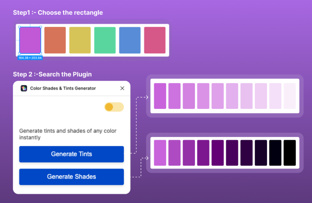
Using a Plugin for Faster Results
If you’re looking for a faster solution, you can use the “Color Shades and Tints Generator” plugin to automate the process of generating tints and shades. Here’s how:
- Install the Plugin In Figma, search for the “Color Shades and Tints Generator” plugin and run it.
- Input Your Hue Colors For each hue in your palette, input the base color into the plugin, and it will automatically generate the associated tints and shades.
- Fine-Tune and Apply Once the plugin generates the colors, you can fine-tune them as needed and apply them directly into your design system.
By using a plugin, you can efficiently generate the tints and shades necessary for a well-rounded and consistent color system.
It’s essential to maintain distinct and harmonious color names and values, ensuring a seamless and balanced palette.
The naming convention should follow the format colorname/value, with no spaces.
3. How to Generate Styles
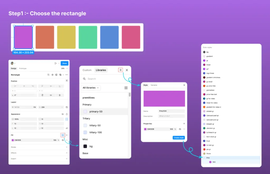
Figma styles are predefined design settings, such as colors, text styles, and effects, that can be applied consistently across your project. Keep exported color palettes and supporting design documentation in online storage so designers and developers can access the same reference files during implementation.
They allow you to maintain uniformity in design by centralizing the management of visual elements. When a style is updated, all instances using that style are automatically updated, making it easy to manage design systems and keep designs cohesive throughout the project.
Manually Create Style
- Set up a frame in Figma and define your complete color range (from light tints to dark shades).
- Select the color in the properties panel, click the four dots next to the color box then according to image click on plus sign select style and enter the color name, and click **”Create Style”**add it to your style library.
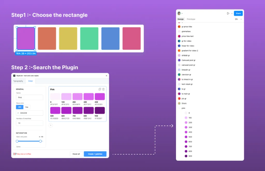
Using a Plugin for Faster Results
- Search for the StyleList- text and color styles Plugin in the Plugins menu in Figma.
- Open the StyleList- text and color styles Plugin and choose color option.
- Select the desired color properties and also you can adjust swatches .
- Click on Create Pallete to apply the color style, then save it to your style library.
4. How to Generate Variables
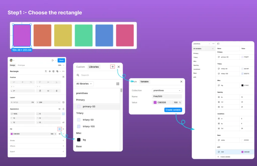
Figma variables are reusable design values, such as colors, typography, and spacing, that can be defined and applied consistently across your designs.
By using variables, you can easily maintain consistency and quickly update design elements globally, as changes to a variable automatically reflect wherever it’s used. This streamlines design workflows and ensures scalability in large projects.
Manually Create Variables
- Set up a frame in Figma and define your complete color range (from light tints to dark shades).
- Select the color in the properties panel, then document the color value as a variable.
- Name your variable appropriately and save it for use in your design system or code.
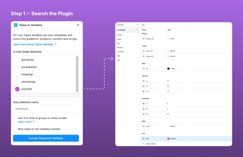
Using a Plugin for Faster Results
- Search for the Style to Variables Plugin in the Plugins menu in Figma.
- Open the Style to Variables Plugin and select the styles you want to convert into variables.
- Enter your collection name in which you want to store your variables.
- Click Convert styles to variables to apply the variables and save them to your design system.
5. How to Create a Style Guide
A style guide in Figma is a comprehensive collection of design elements, including colors, typography, spacing, logo template, and components, that ensures consistency across a project.
It helps designers and developers maintain a cohesive visual identity by providing clear guidelines and reusable assets, streamlining collaboration, and speeding up the design and development process.
One of the significant advantages of a Tailwind Ready Color System in Figma is that it simplifies the process of managing color variables across different design projects, ensuring continuity.
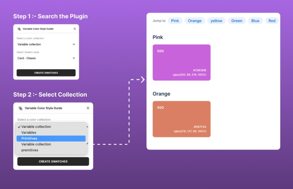
Using the Variable Color Style Guide Plugin
- Search for the Variable Color Style Guide Plugin in the Plugins menu in Figma.
- Open the Plugin and select the collection of the variables to create style guide.
- Choose the style guide format that best suits your needs.
- Click on “Create Swatches” to generate the style guide.
Tool to Design Faster: FlyonUI Figma Kit
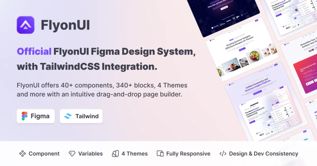
For even greater efficiency, consider leveraging pre-built resources like FlyonUI, an open-source Tailwind components library that includes a dedicated Figma design system with semantic colors (e.g., primary, secondary, accent, neutral, base-100) and unlimited themes perfect for jumpstarting your palette without reinventing the wheel.
It also come with:
- Tailwind AI Builder
- 500+ Tailwind Blocks
- 1000+ Tailwind Components
- 20+ Tailwind Templates
Conclusion
Creating a Tailwind ready color system in Figma is a game-changer for designers and developers alike; it brings consistency to your palette, streamlines workflows, and boosts collaboration across teams. Consistent brand colors can then be carried into campaign variations produced with an AI Ad Generator.
By incorporating this system, you’re not just elevating the visual appeal of your designs; you’re also bridging the gap between aesthetics and functionality, ensuring everything syncs effortlessly with Tailwind CSS for a truly seamless handoff to code.
At its core, it’s essential for crafting effective, harmonious designs that translate smoothly into development, saving hours of back-and-forth tweaks. Plus, its built-in flexibility means you can evolve colors as trends shift or project needs change, keeping your work fresh without starting from scratch.
In the end, this approach strengthens your entire design foundation, ramping up productivity from ideation to launch, so your creations don’t just look polished; they perform flawlessly in the real world.
To accelerate your process further, integrate resources like FlyonUI Tailwind UI library for its awesome Figma-Tailwind synergy, empowering you to build responsive UIs with minimal friction.
Hope you find this article helpful..!!